Case study · Rebrand & website · 2024
Value Trust
A new identity and website for a Dubai IT and finance consultancy ready to win banks and large corporates, built around a handshake.
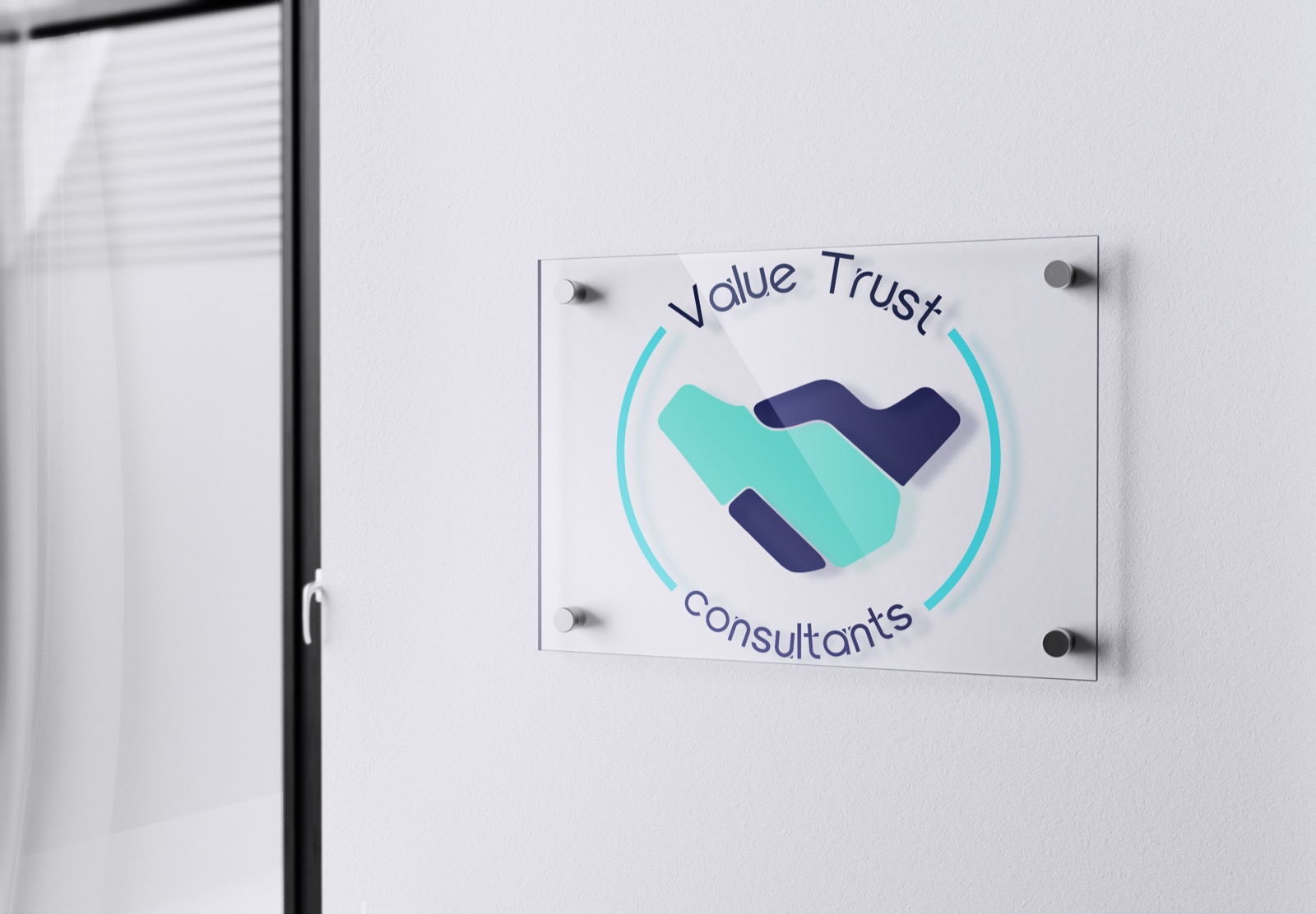
Develop a new logo and website that communicate Value Trust's values in the competitive IT and finance sectors.
A flexible identity that reproduces anywhere, and a site that showcases their expertise to high-value clients.
The problem
A brand holding itself back
The old logo used gradients that failed on business cards, had no alternate versions, and clients struggled to pronounce the name.
Universal, flexible, unforgettable
An identity that's easy to reproduce in print, digital, embossed or single colour, and legible from business card to billboard.
Built for bigger business
Value Trust was moving from small businesses to banks and corporates. The brand had to project authority at enterprise level.
Client research
“Dubai is a culture built on trust and handshake agreements. We want our clients to know we have the knowledge and the values to earn that trust.”
“We want something simple.”
A mark understood across cultures and languages without explanation.
“Not too many colours.”
Production-first: every decision tested against real print constraints.
“No V or T in it.”
An iconic symbol that carries their values, not just their initials.
Logo conceptualisation
Concept ideation
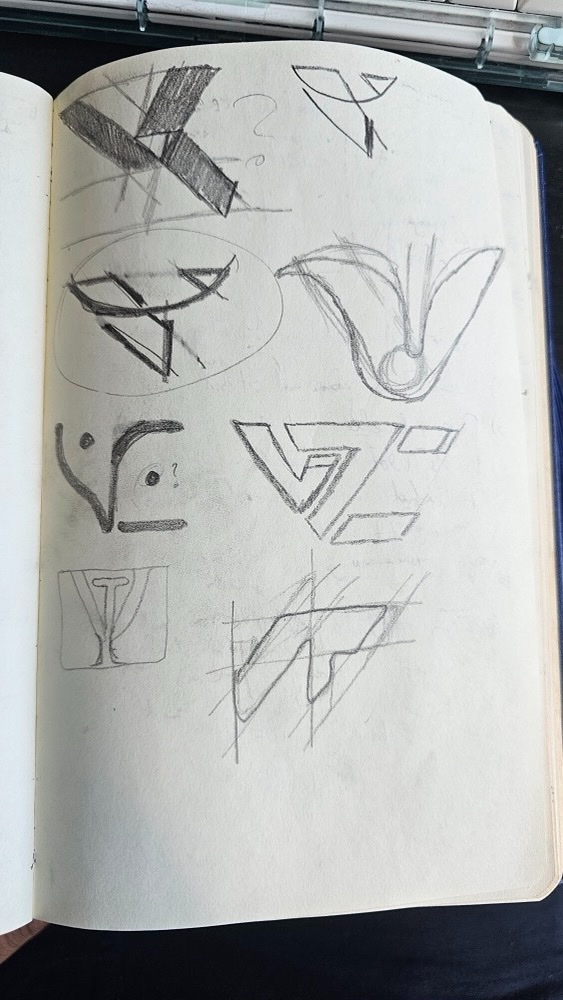
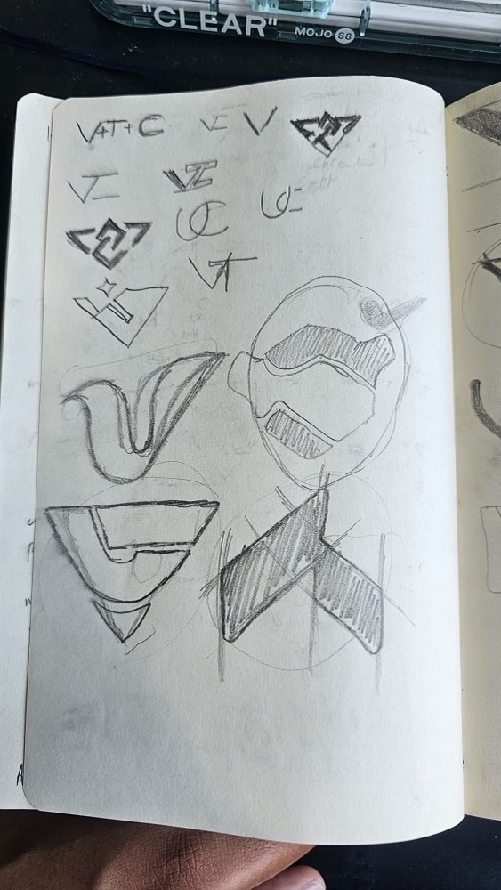
I sketched a range of ideas exploring the letters V, T and C alongside abstract geometric approaches, looking for logomarks that convey precision, structure and financial authority.
The goal was a form that could carry the weight of trust as a concept, not just as a letterform.
Three directions



What does the logo represent?
A V that's a handshake


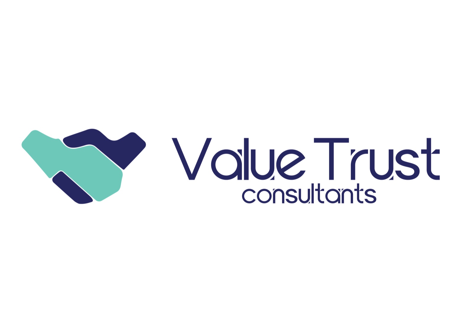
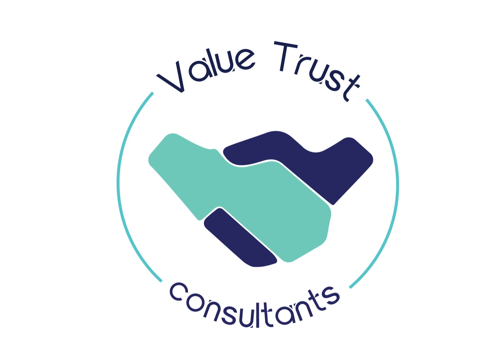
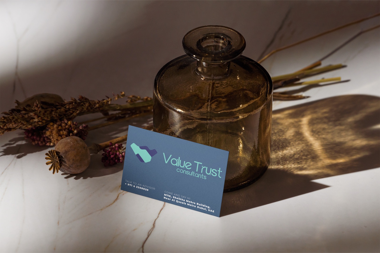
The Value Trust Consultants (VTC) logo is an abstract letter V that blends value and trust in one fluid mark. At its core is a handshake, the universal symbol of trust, agreement and partnership.
The lighter shade is the client and the trust they place in VTC; the darker shade is the values and expertise VTC brings to every engagement. Smooth lines reflect adaptability, innovation and a forward-thinking firm.
The mark stands alone without text, reproduces flawlessly at any scale, and carries meaning without needing explanation.
Final logos
Brand system
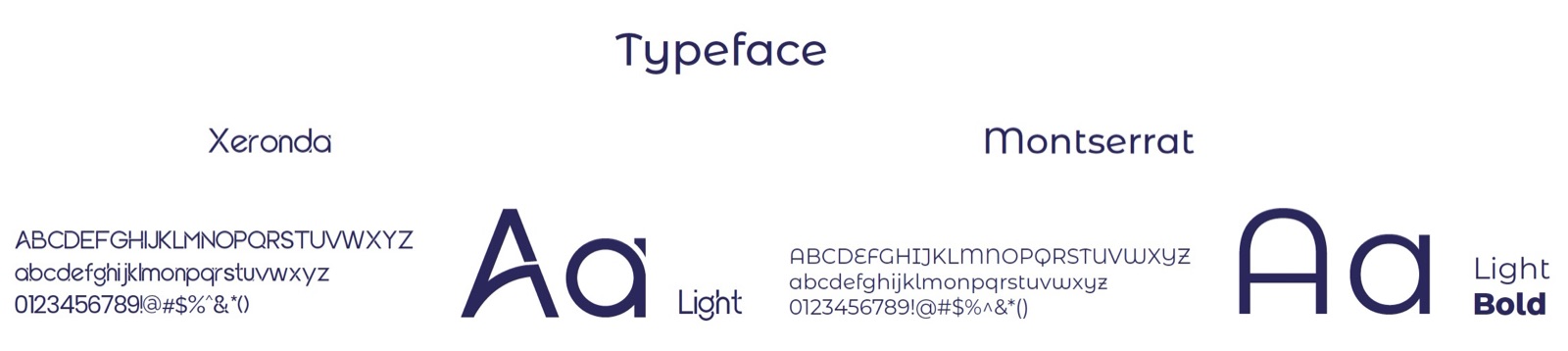
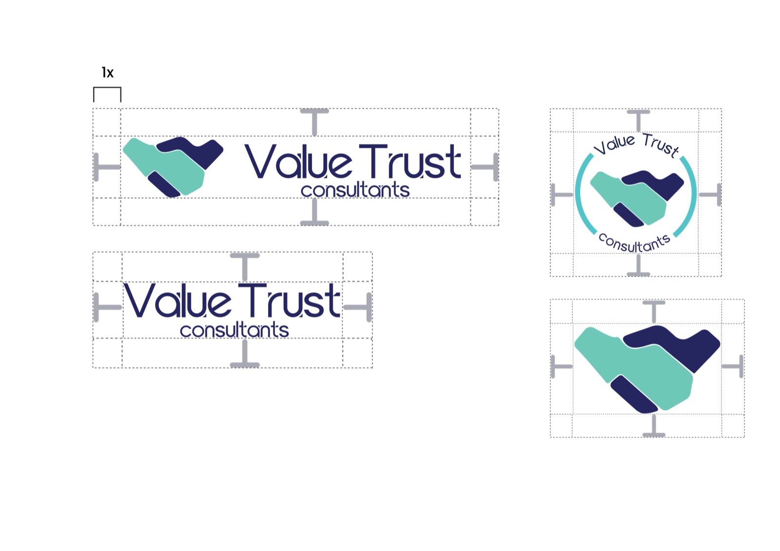
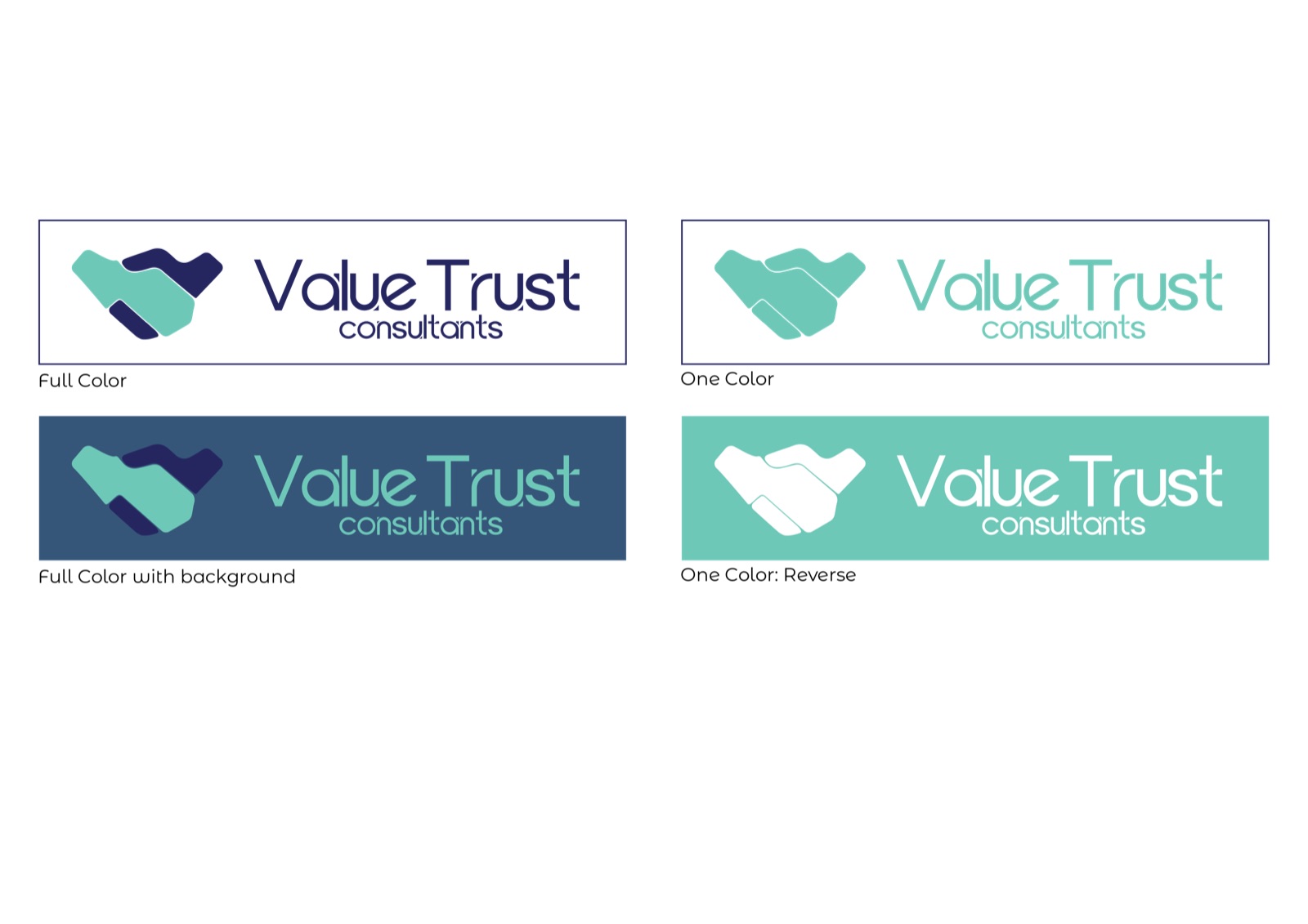
The website · Why redesign
From outdated to enterprise-ready.
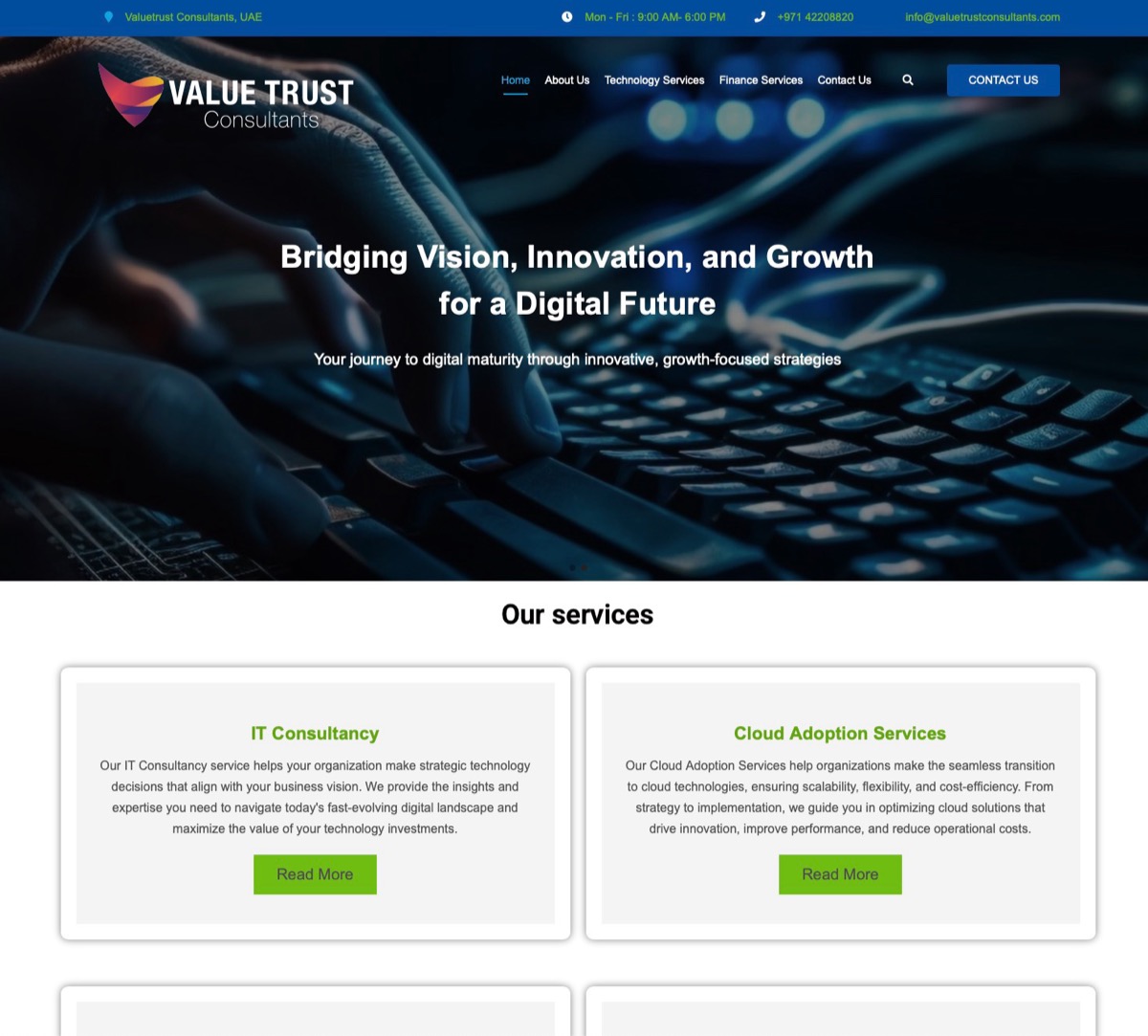
The original site lacked the visual authority needed to compete for enterprise clients in IT and finance.
It relied on generic stock photography with no coherent brand system. Navigation was cluttered, service pages were inconsistent, and the overall impression failed to project confidence to high-value corporate prospects.
The redesign addressed every layer: layout, typography, messaging and hierarchy.
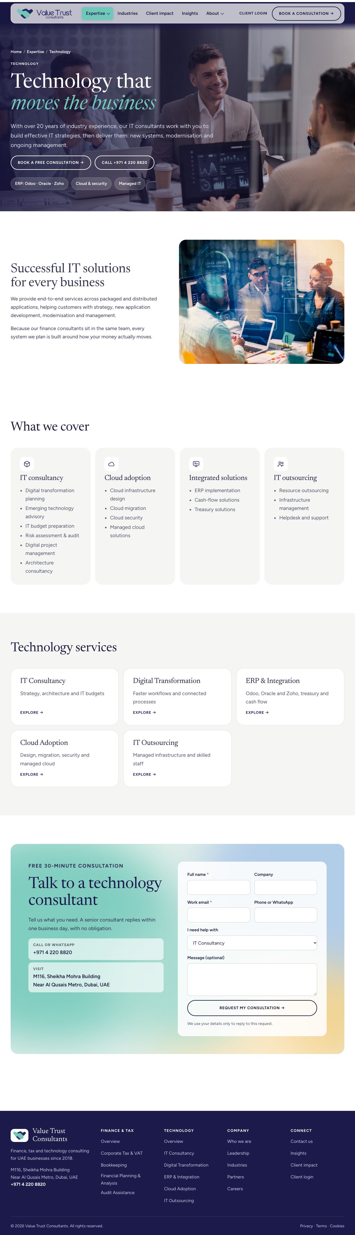
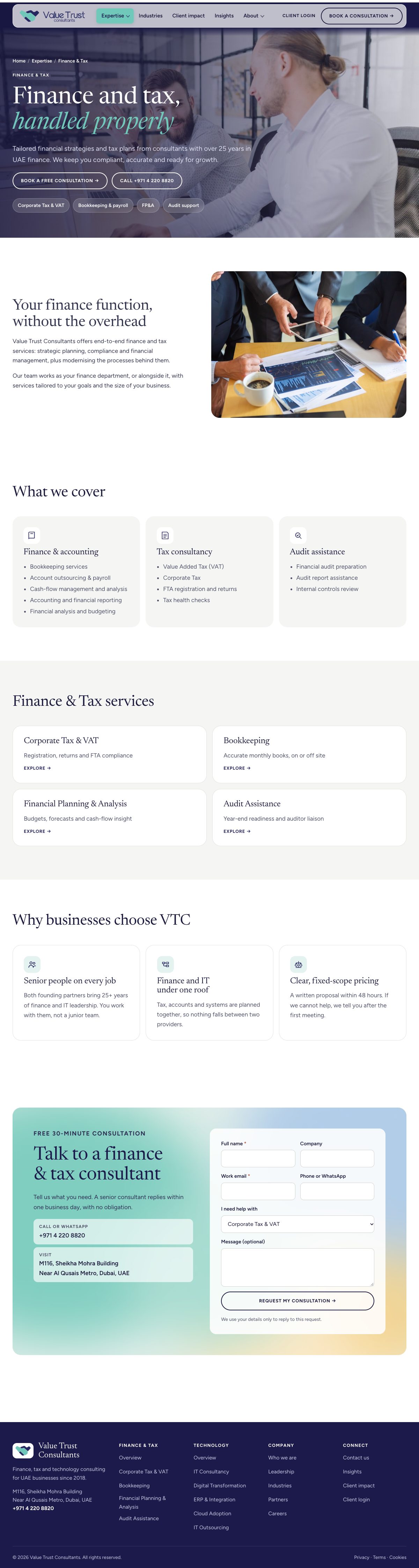
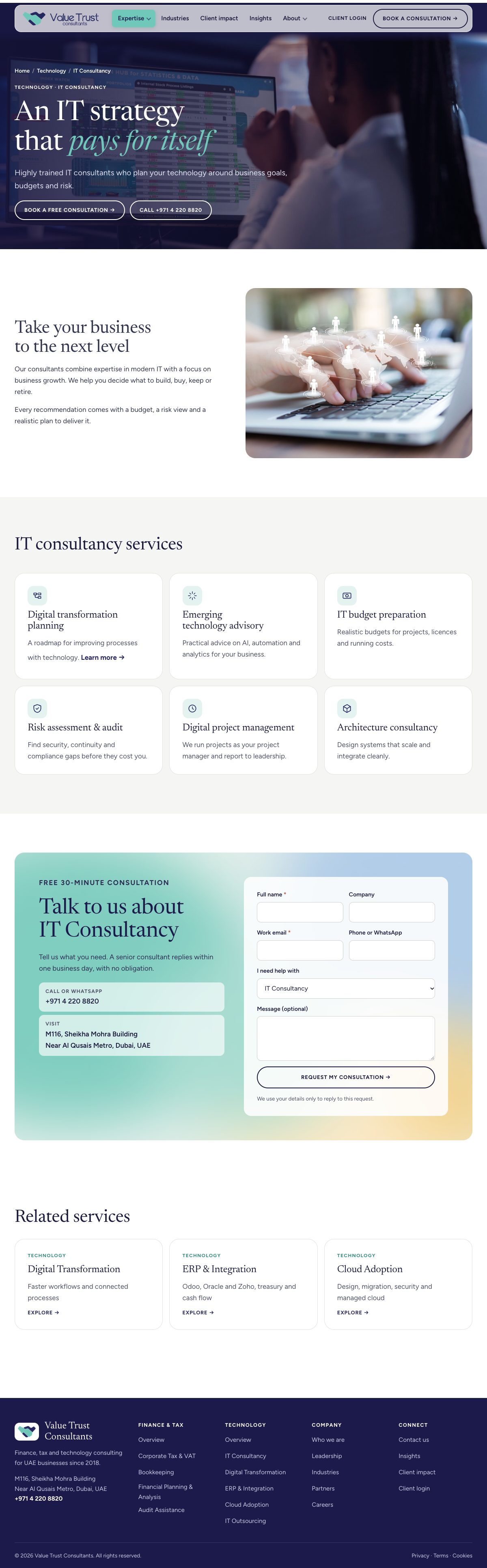
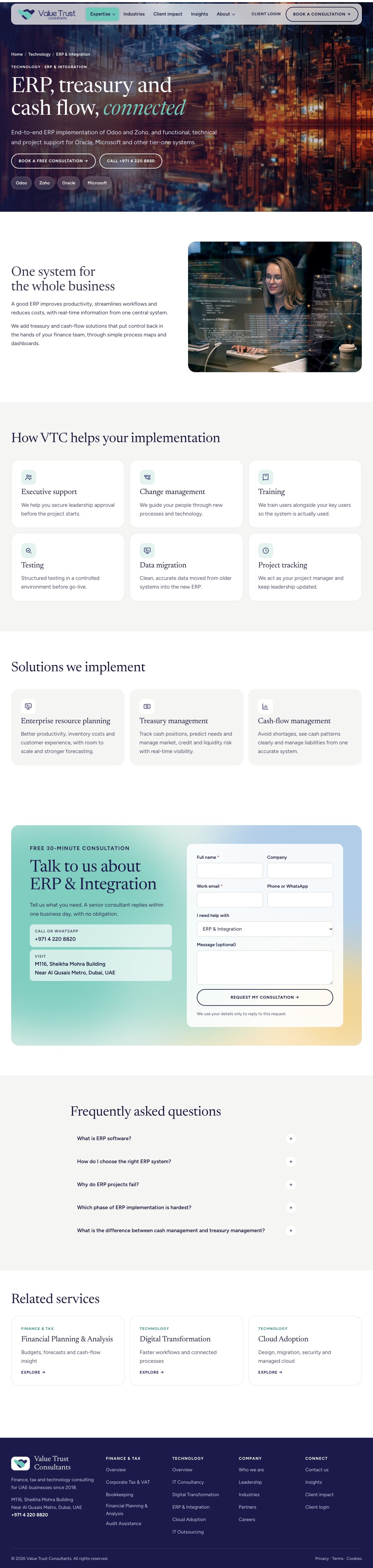
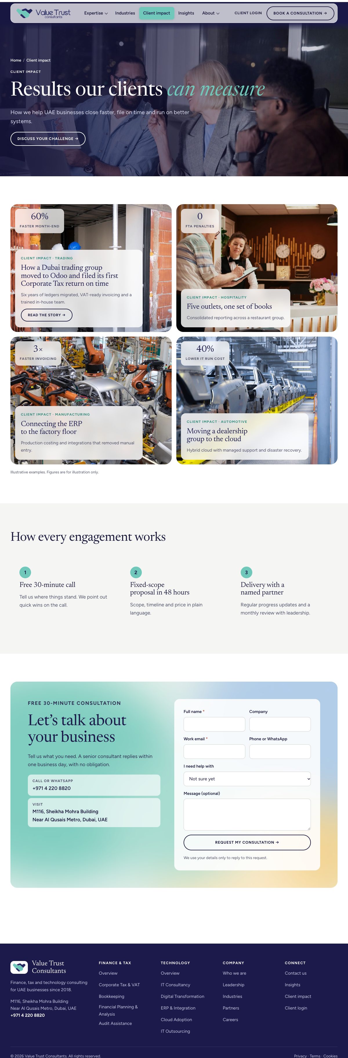
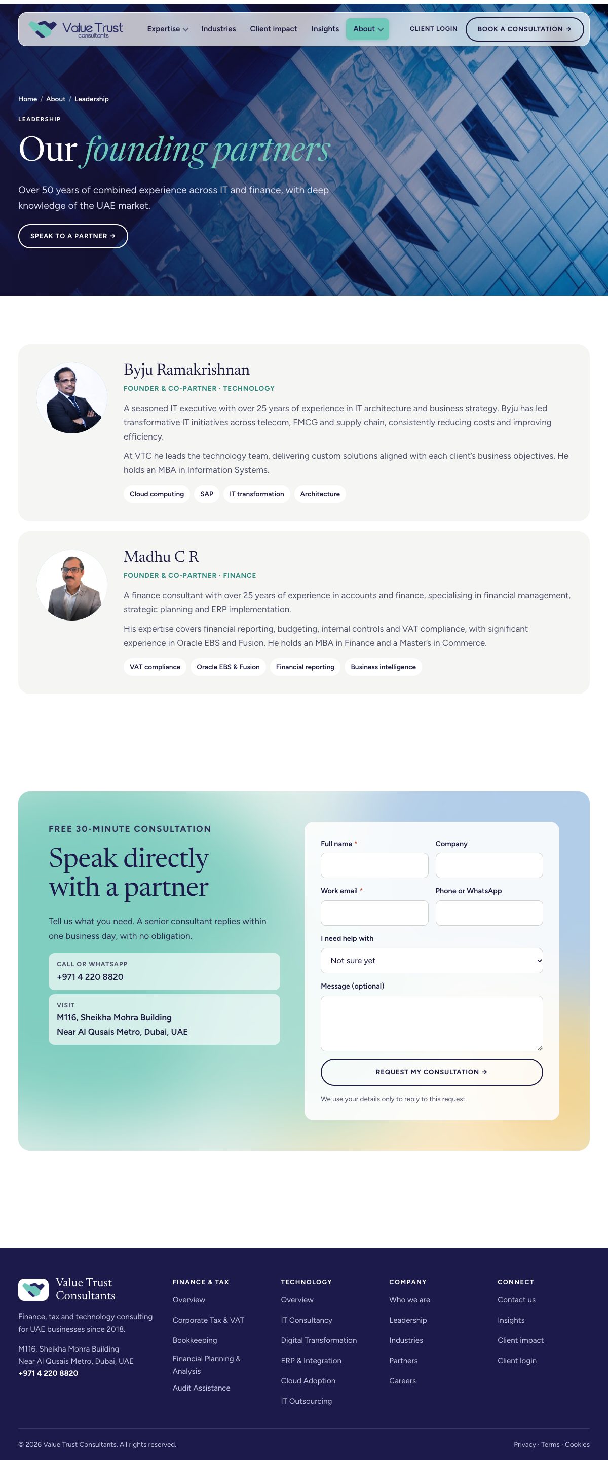
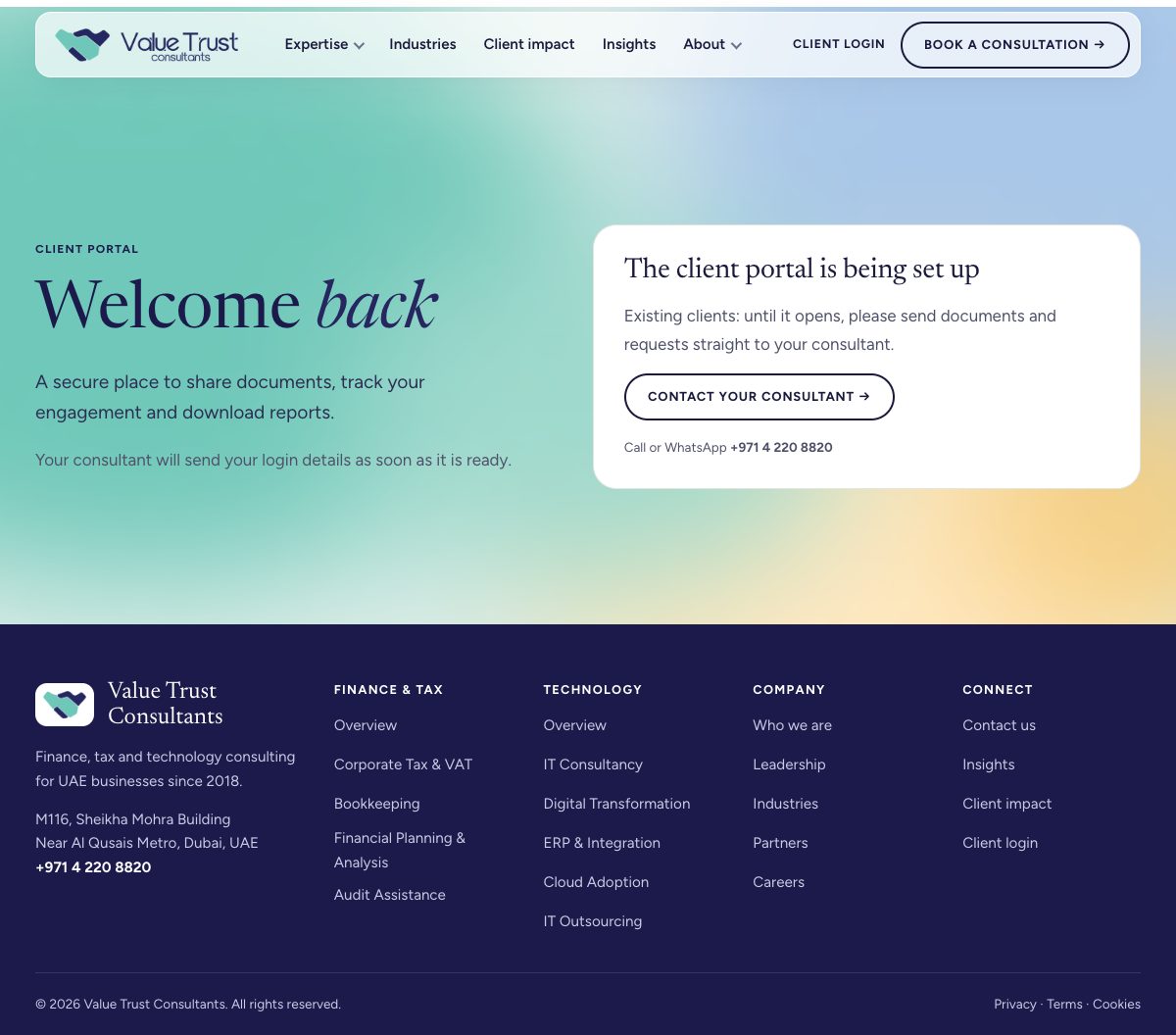
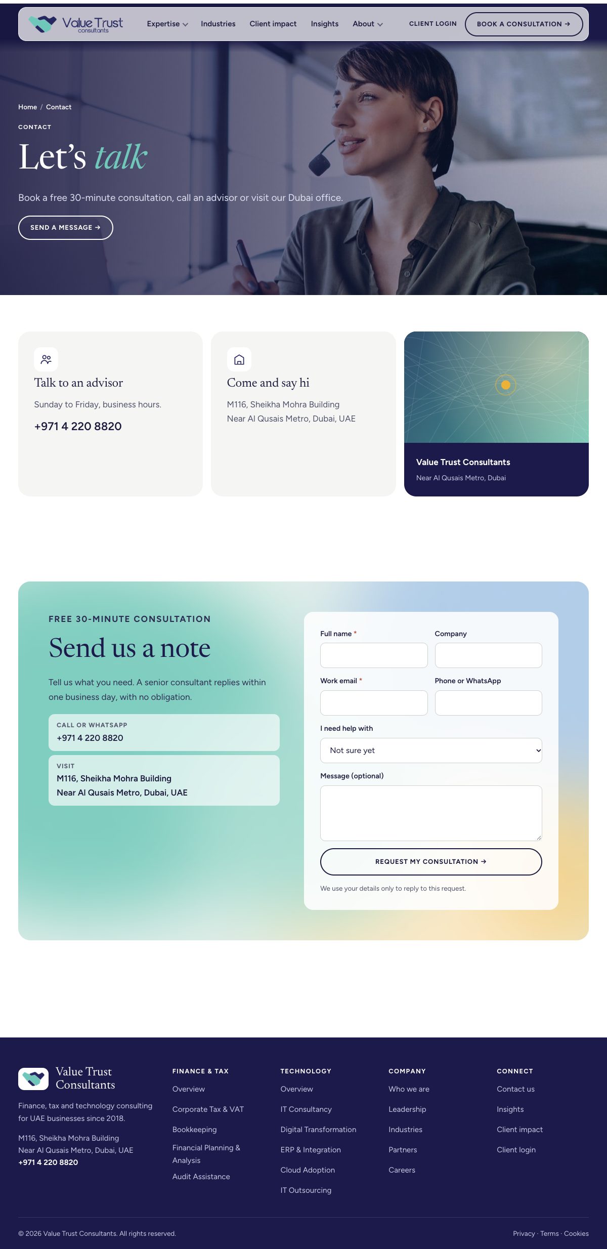
Designed page by page
Every page built from scratch in one system: consistent type, controlled colour and clear hierarchy. Scroll inside each page to see it in full.
Visit valuetrustconsultants.com ↗